Shop Template
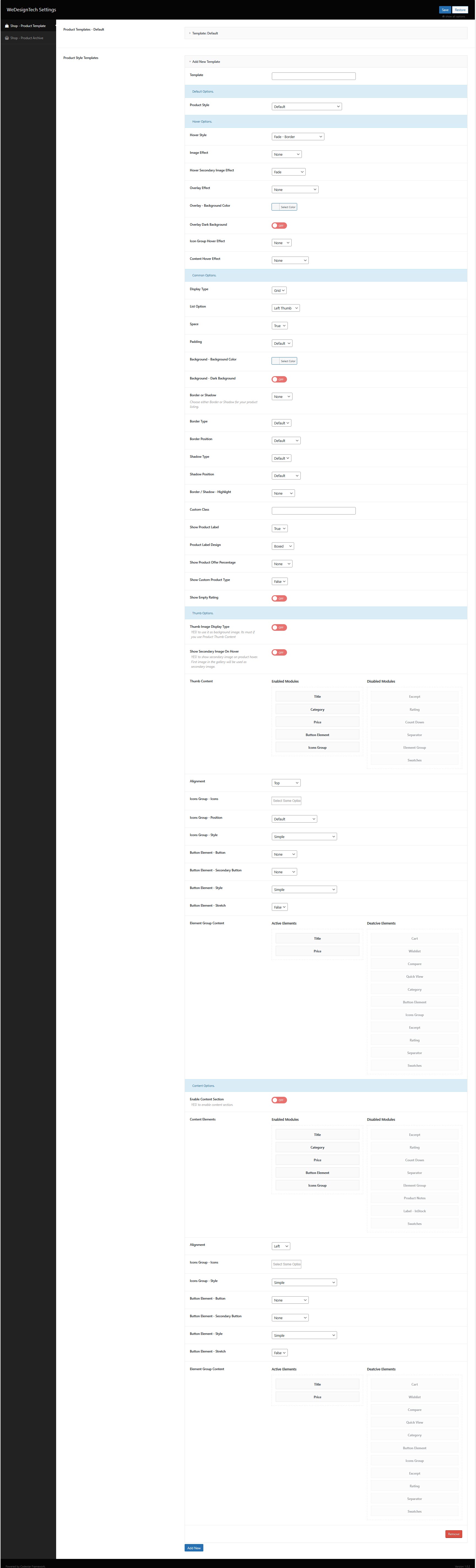
The Product Display Settings allow you to customize the layout and style of your shop items. You can choose between grid or list layouts, adjust the overall style, and enable visual effects such as fade-in animations and optional hover effects. Labels and discount badges can be displayed to highlight promotions. You also have control over button styles, icon placement, and the use of custom CSS classes. Additionally, border and shadow effects can be configured to enhance the visual appearance of your product listings
Default Options These are the basic settings that apply to the product template by default, such as overall layout and style.
Common Options General settings that affect the appearance and behavior of products, like display type (grid or list), spacing, background colors, borders, or shadows.
Hover Options Settings that control effects when users hover over a product, including image animations, overlays, and icon or content changes.
Thumb Options Configuration for the product thumbnail images—how they are displayed, secondary images on hover, and related visual effects.
Content Options Controls which content elements appear on the product cards, such as title, price, buttons, ratings, and their styling or alignment.